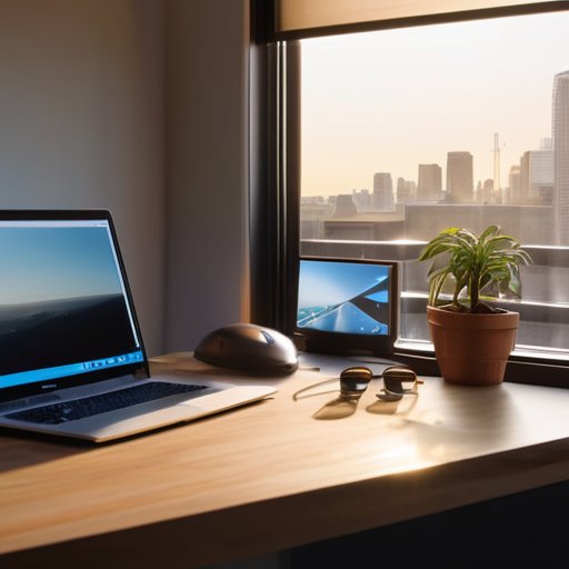
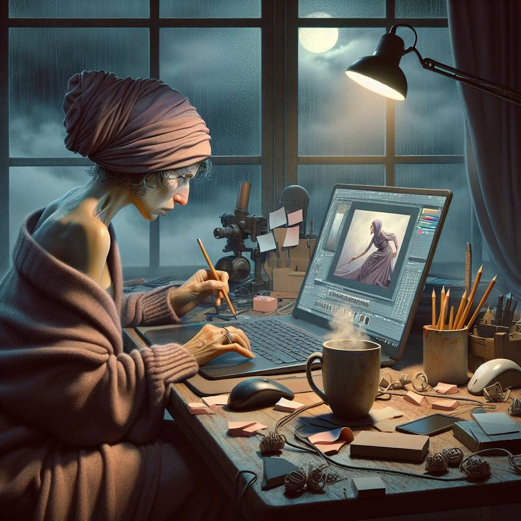
I once spent an entire afternoon convincing myself that scrolling through Pinterest counted as “productive work.” There I was, hunched over my laptop, diving into a digital rabbit hole of perfectly curated mood boards, each more unattainable than the last. It was a self-deception of epic proportions, masquerading as project planning. Let’s be honest—how many times have you clicked “Save” on a board that promised a visual nirvana, only to find your own attempts looking like a chaotic explosion of color and misplaced ambition?
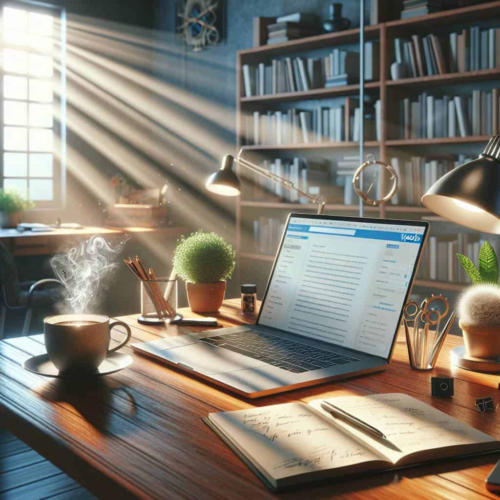
But I’m not here to tell you that creating a mood board is easy or that it will magically capture the essence of your project without any effort. No, this article will take you through the raw, unfiltered truth of crafting a mood board that doesn’t just mimic what you see online but actually serves a purpose. We’ll explore why your color palette matters, how to navigate the minefield of visual direction, and yes, how to avoid the common pitfalls that turn planning into procrastination. Buckle up—it’s time to dismantle assumptions and sharpen perspectives.
Table of Contents
Lost in the Pinterest Abyss: My Quest for the Perfect Color Palette
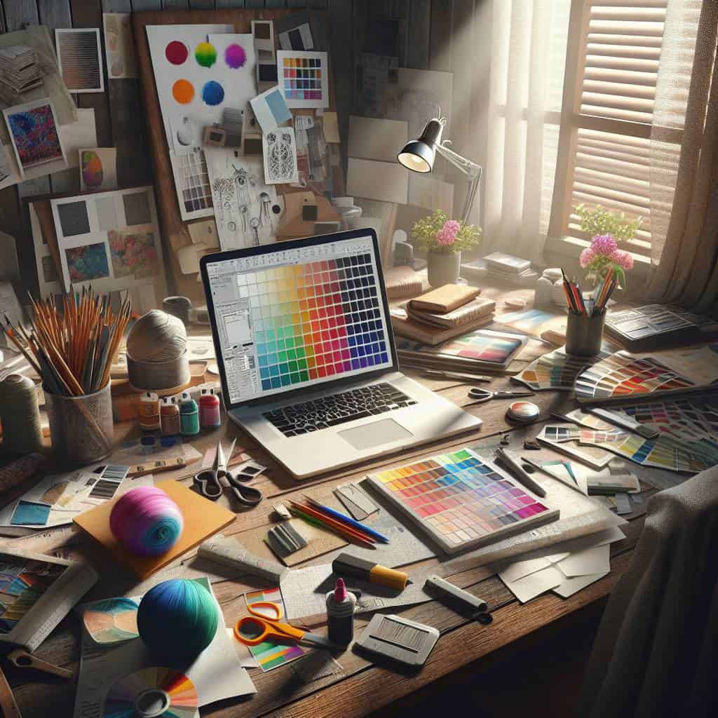
Diving into Pinterest in search of the perfect color palette is like wandering through a labyrinth with no clear exit. It’s a seduction of endless scrolling, where each click promises the holy grail of visual direction but often leads to the same predictable abyss. You start with a clear vision, armed with the determination to define the mood of your latest project. But inevitably, you’re swept into a vortex of endless boards, each one more tantalizing than the last—a kaleidoscope of hues that seem to whisper, “Pick me, I’m the one.” Yet, what begins as a strategic mission quickly devolves into an exercise in frustration. You end up with a hundred saved pins, each a glittering shard of inspiration that ultimately clashes when viewed together.
But here’s the brutal truth: Pinterest is not your savior. It’s not going to hand you the perfect palette on a silver platter. It’s an enabler of indecision, a playground where ideas go to multiply and mutate. Sure, it’s a starting point, a place to gather and sift. But the real work—crafting a cohesive palette that’s more than just aesthetically pleasing—requires stepping away from the screen. It demands a ruthless eye, an ability to cut through the noise and peel back the layers until the essence of what you need is laid bare. So, while Pinterest can be your muse, remember it’s your own discerning eye that must shape the raw material into something that genuinely reflects the project’s soul. The color palette isn’t just a collection of pretty shades; it’s the very DNA of your design’s identity.
The Illusion of Perfect Hues
In the chaotic dance of creativity, a mood board is less a roadmap and more a fever dream—a kaleidoscope of color palettes whispering the sweet nothings of a project yet to be born.
The Unfinished Canvas of Creativity
In the end, the quest wasn’t about finding the perfect palette or the most cohesive board. It was about embracing the chaos of creativity, the unpredictable dance between inspiration and execution. Pinterest might seduce us with its siren call of perfection, but it’s the imperfections—the raw, unfiltered moments—that truly drive innovation. My mood board may never mirror the polished images that float in the digital ether, but that’s the point. It’s a living, breathing entity, evolving with every brushstroke of my imagination.
Visual direction isn’t a destination; it’s a journey. A journey filled with detours, unexpected turns, and sometimes, dead ends. But isn’t that the thrill of it all? The anticipation of discovery, the joy of stumbling upon a color combination you didn’t know you were searching for. So, here’s to the perpetual project, the ever-elusive masterpiece that keeps us hungry and humble. Because in the world of design, as in life, it’s the pursuit—not the perfection—that defines us.