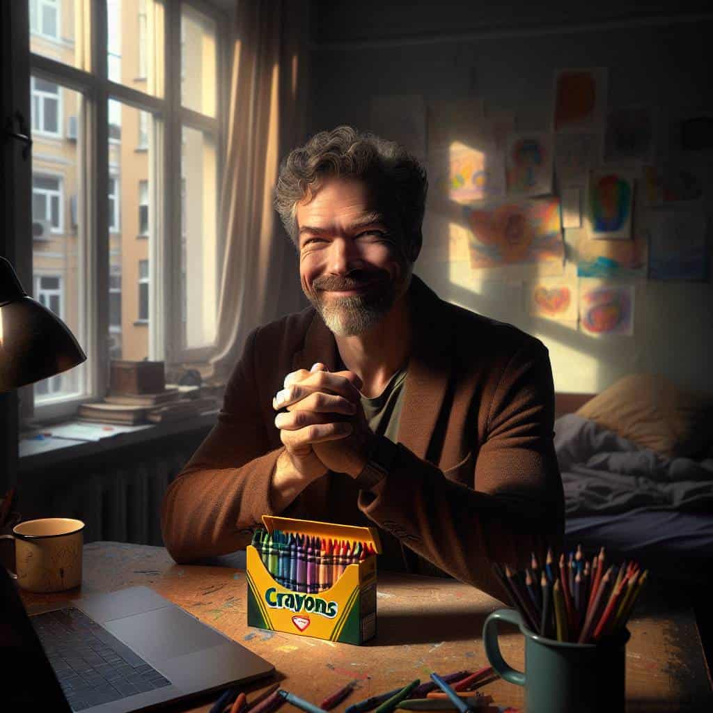
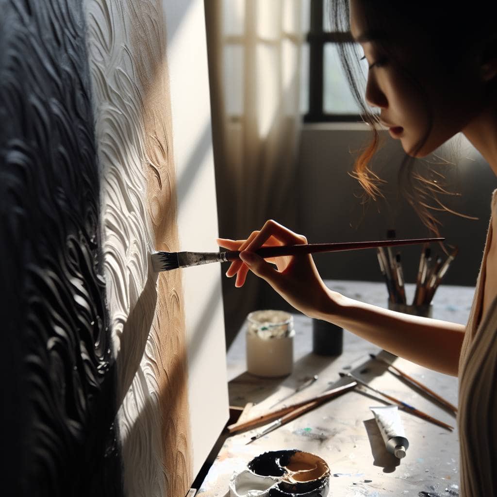
I once got lost in a forest—literally and creatively. There I was, standing knee-deep in a sea of ferns, clutching a sketchbook like it was a life raft, while the universe mocked me with its effortless beauty. Every shade around me was alive, a symphony of greens playing against the golden notes of the afternoon sun. And me, with my meticulously curated palette, feeling like a kid who brought crayons to a Monet exhibition. It was a humbling slap from Mother Nature, reminding me that her colors don’t just exist—they breathe, argue, and harmonize in ways that no color wheel could capture.
But here’s the thing: I learned more from those tangled branches and dappled light than any design seminar. So, if you’re ready to ditch the predictable and embrace the wild, let’s dive into the riotous world of nature’s color palettes. We’ll explore schemes that shift with the seasons, colors that alter moods, and how a single photograph can transform your entire approach to design. This isn’t just about looking; it’s about seeing, feeling, and letting those vibrant hues punch you right in the creative gut.
Table of Contents
Seasonal Mood Swings: Nature’s Color Schemes That Outshine Any Instagram Board
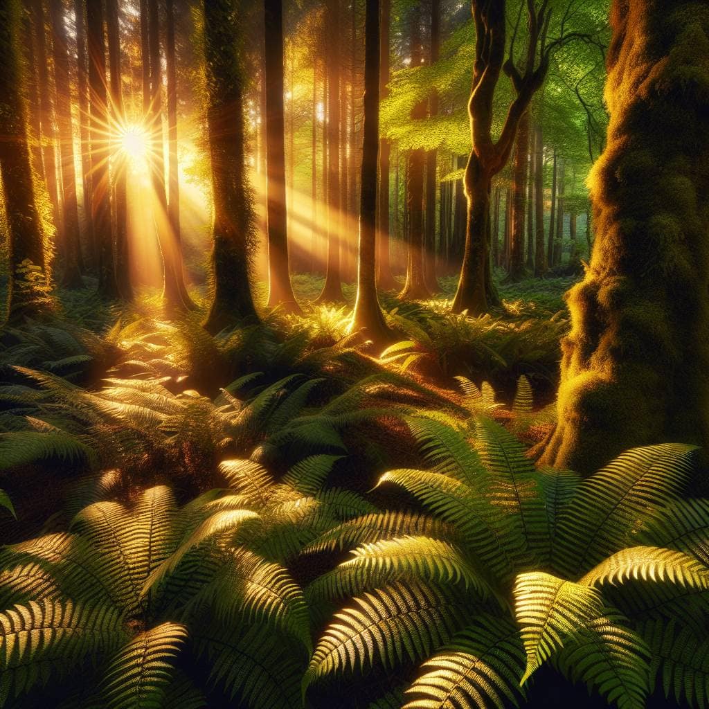
Let’s talk about the real mood ring of the universe—nature’s seasonal color schemes. Forget those meticulously curated Instagram boards filled with pastels and muted tones; nature’s got a whole different game plan. Take a peek outside. It’s like Mother Nature has this unspoken agreement to change her wardrobe every few months, and she’s got a way better stylist than any influencer out there. Picture spring with its audacious explosion of greens and yellows, like a fresh start screaming from every budding leaf. It’s the kind of vibrant, life-affirming color burst that makes your carefully selected Pantone swatch look like it needs a double espresso just to keep up.
But let’s not stop there. As we roll into autumn, the palette shifts dramatically. It’s all about those rich, warm hues—deep oranges, fiery reds, and golden yellows that practically glow under the soft, slanting sunlight. It’s nature’s way of wrapping us in a cozy, technicolor blanket, making the world feel like it’s caught in a perpetual golden hour. And if you’ve ever tried capturing this grandeur in a photograph, you know it’s a game of patience and timing. No filter can do justice to the way the light dances through those crisp fall leaves. So next time you’re tempted to scroll through yet another grid of perfectly arranged succulents and latte art, remember nature’s got a show running outside, and it’s not one to miss.
The Symphony of Seasons
Nature’s palette is a wild orchestra, where each season conducts a new symphony of colors—painting moods, crafting stories, and reshaping the world in hues no designer could ever dream up.
Nature’s Palette: An Unending Canvas
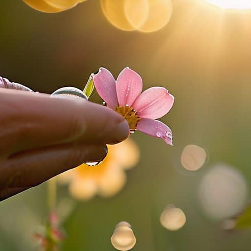
There’s something humbling about the way nature weaves its colors, like an artist with a brush dipped in magic. Each season, a new masterpiece unfurls—winter’s solemn blues and silvers melting into spring’s riot of pastels, each hue whispering its own secret. I’ve found myself chasing these colors, camera in hand, desperate to capture even a fraction of their brilliance. But perhaps the real magic lies in the chase itself, the perpetual quest to bottle the ineffable.
In this dance of light and shadow, I’ve learned that no Instagram board or photography trick can truly replicate nature’s audacious flair. Each click of the shutter is a humble nod to the vast, untamed palette that exists just beyond our front doors. So maybe it’s not about perfectly curating our own little color schemes but rather letting nature’s unpredictable brushstrokes inspire us to see the world—and our art—with fresh eyes. After all, who needs another beige wall when you’ve got the world as your canvas?