I once found myself staring at a seemingly empty webpage, a blank canvas save for a lone, smug rectangle in the center. “Welcome to the future of web design,” it proclaimed in a whisper, almost daring me to look for more. But there was nothing more—just stark white space mocking my need for substance. Minimalist web design, they called it. A triumph of restraint, I called it. Sometimes, it feels like designers are playing a game of how little can we do and still get paid? Yet, I can’t help but admire the audacity. There’s a fine line between brilliance and laziness, and often, it’s as thin as the margins on these pages.
As we dive into this showcase, let’s sift through the clutter—or lack thereof—and see where “less is more” genuinely shines. Expect a journey through clean lines and user interfaces that don’t just serve a purpose but make a statement. We’ll explore trends that might make you question everything you thought you knew about web design, and maybe, just maybe, you’ll find beauty in the void. This isn’t about coddling you with simplicity; it’s about challenging the complexity of simplicity itself.
Table of Contents
My Lifelong Struggle With Clean
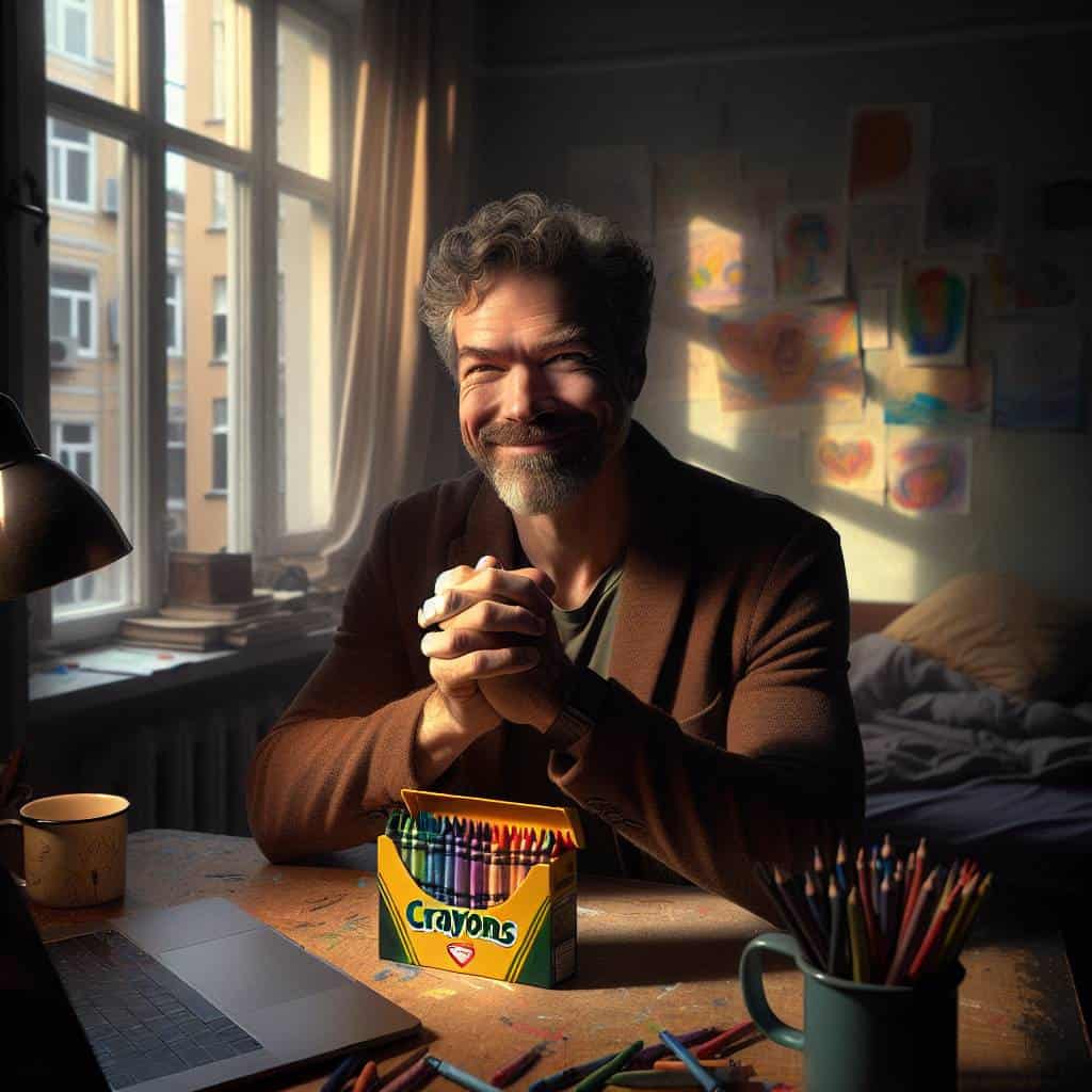
Clean. It’s a word that haunts me like a ghost in the machine. As a graphic designer swimming in the chaos of a metropolis, my life has been a perpetual tug-of-war with the concept of ‘clean.’ You see, clean isn’t just an aesthetic choice—it’s an ethos, a relentless pursuit of clarity amidst the cacophony. I grew up in a world where everything demanded attention, where loud was the norm, and subtlety was a rare commodity. So, when I stumbled into the world of web design, the minimalist mantra of ‘less is more’ felt like both a revelation and a rebellion. But clean isn’t always easy. It’s a discipline that demands precision, a ruthless editor that forces you to strip away the superfluous until only the essential remains.
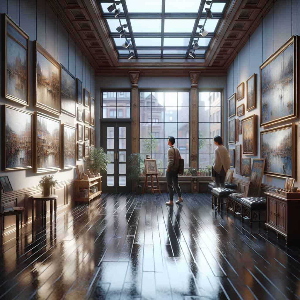
But let’s not kid ourselves—clean design can be a double-edged sword. It’s either the zenith of artistic restraint or a lazy shortcut masquerading as sophistication. I’ve witnessed it all. The websites that wear their minimalism like a badge of honor, showcasing white space as if it’s the holy grail of user interface design. And then there are those that confuse sparse with soulless, offering an experience so devoid of personality that it feels like navigating a sterile, digital desert. The struggle is real, and it’s not just about aesthetics. It’s about crafting an interface that respects the user’s time and intelligence, guiding them through an experience that is as intuitive as it is engaging. In a world drowning in noise, achieving true clarity is my white whale, a lifelong pursuit that I tackle one pixel at a time.
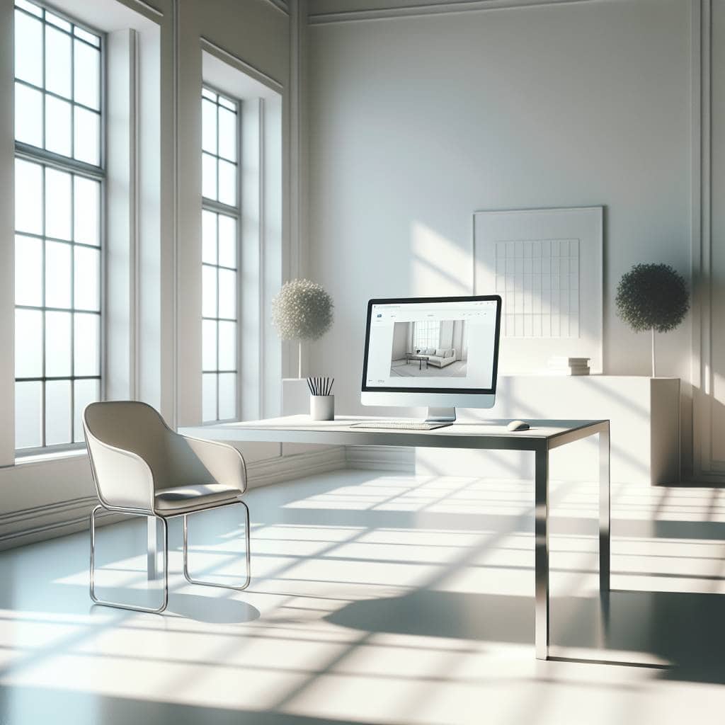
The Art of Subtraction
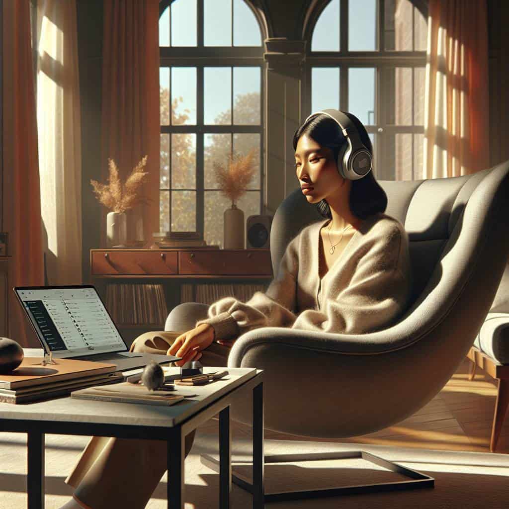
In minimalist web design, the real mastery lies in knowing which elements to remove. It’s the silent symphony of less that makes the user experience sing.
The Art of Precision: My Minimalist Odyssey
So, where does this leave me? In the ever-evolving dance of pixels and ideas, I’ve found that minimalist web design isn’t just a trend—it’s a testament to the power of restraint. It’s about knowing when to stop, when to let the white space breathe, and when to allow the user’s journey to unfold naturally. Sure, there are moments when minimalism feels like a cop-out, a way to dress up lackluster creativity as intentional design. But when done right, it’s a silent symphony that speaks volumes without uttering a word.
Ultimately, my journey through minimalist web showcases isn’t just about aesthetics; it’s about clarity and purpose. It’s about creating spaces that respect the user’s intellect and the designer’s craft. In a world cluttered with distractions, there’s something profoundly satisfying about stripping away the noise to reveal something pure and purposeful. Maybe that’s the real beauty of it all: not just less is more, but less is the essence of more. And that’s a philosophy I can live with.