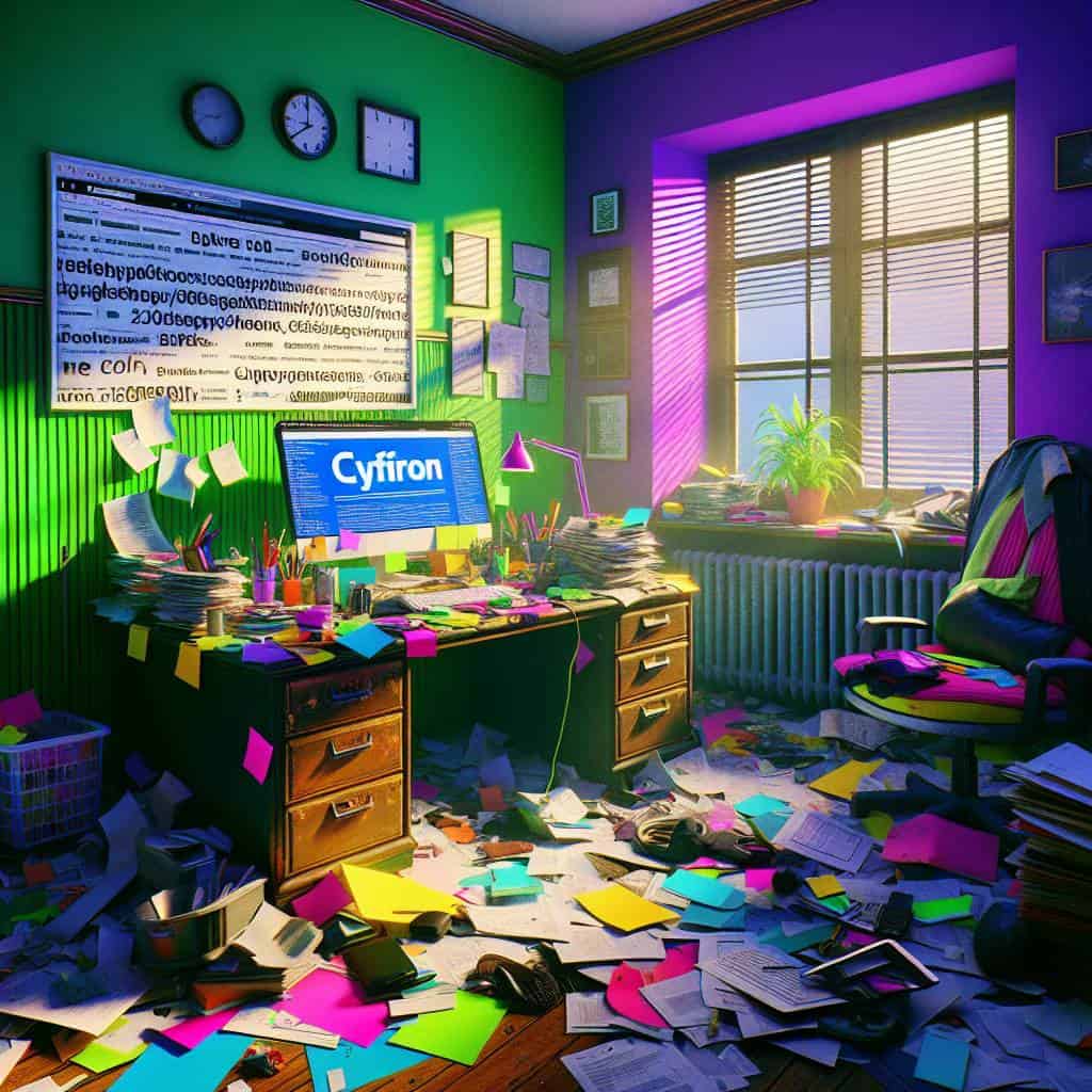
Picture this: a young, ambitious designer—me—armed with nothing but a sketchpad and a dream. I’m in my first real design gig, and my boss tosses me a project with one ominous instruction: “Stick to the grid.” I remember staring at those intersecting lines like a caged animal, wondering when design became less about freedom and more about following the rules. But in that moment of despair, I realized something. The grid isn’t there to stifle creativity; it’s the backbone that lets your ideas stand tall without toppling over like a house of cards. The grid system is like that friend who tells you to wear a seatbelt—annoying but crucial. Without it, you’re just playing a game of Pixel Jenga.
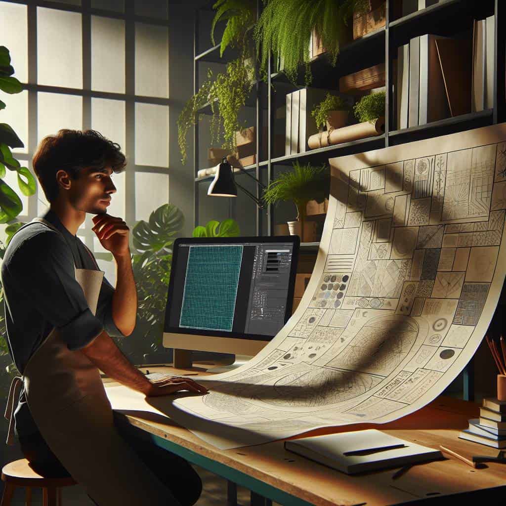
So here’s the deal. We’re diving into the grid system, that necessary evil of design that can make or break your project. Whether you’re wrestling with web layouts, editorial spreads, or just trying to make sense of the chaos, I’ve got you covered. We’ll explore how to bend the grid to your will and craft layouts that don’t just look good but feel right. Let’s turn those lines from a prison into a playground. Ready to break the rules gracefully? Stick around.
Table of Contents
First Creative Heading About the grid system in design
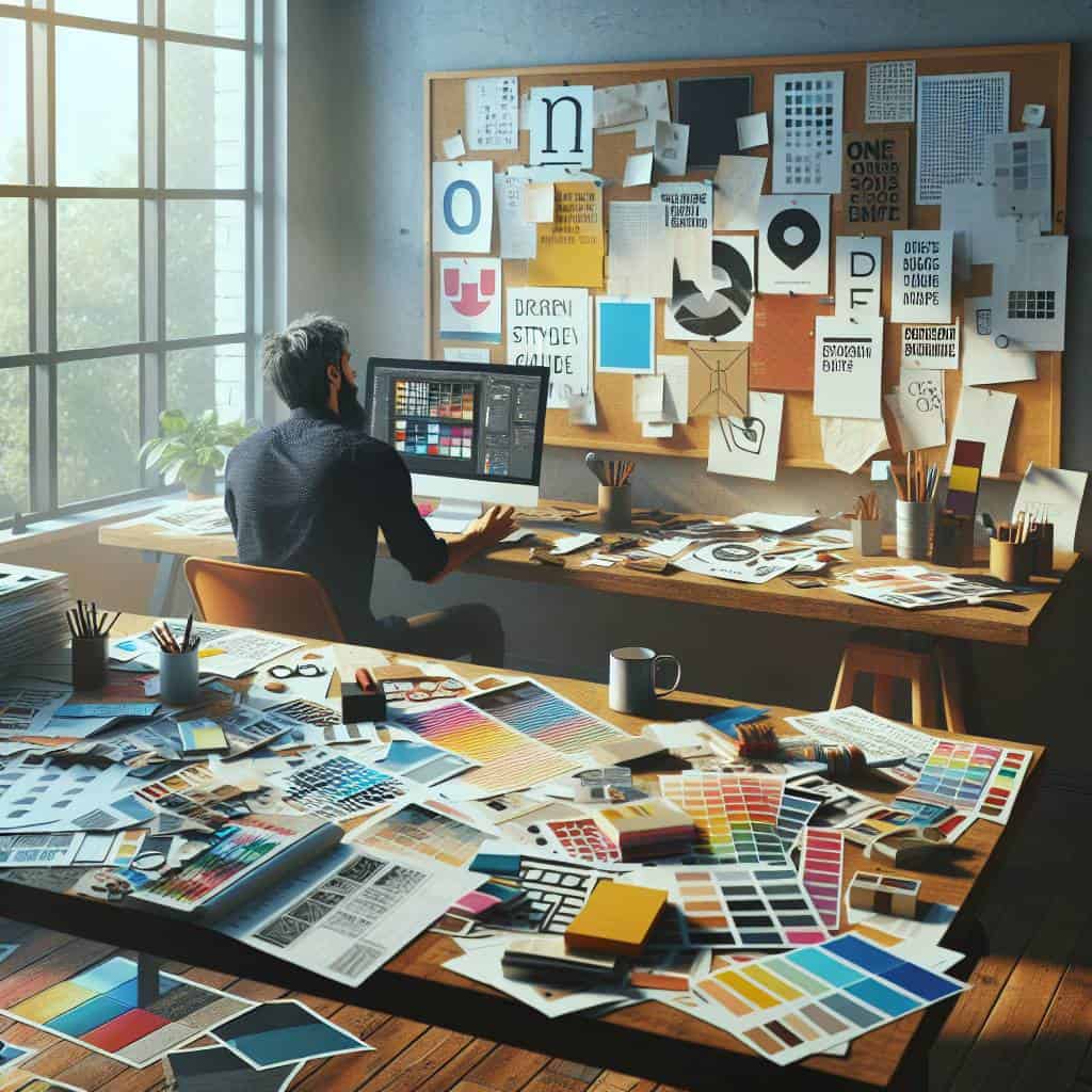
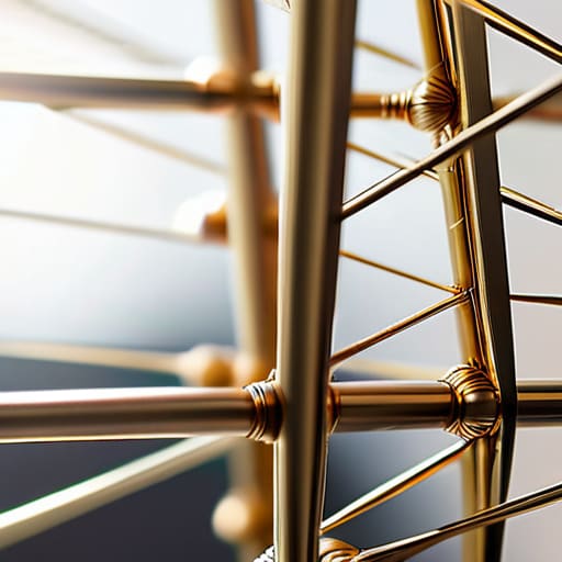
Imagine the grid system as the invisible scaffolding holding up the chaotic masterpiece of a vibrant city skyline. It’s the subtle whisper of order amidst the clamor of creativity, the silent dance partner that guides every step without stealing the spotlight. In the realm of design, grids are the unsung heroes; they provide the structure that allows our wild imaginations to soar without toppling into an abyss of disarray. They’re the unyielding backbone of layout design, whether you’re crafting a sleek web interface or a sprawling editorial spread. But here’s the kicker: grids aren’t constraints—they’re the freedom to explore within boundaries. They let you push the envelope, knowing there’s a safety net below when you teeter on the edge of innovation.
I’ve always seen grids as the tightrope artists of the design world. They balance the heavy weight of information with the feather-light touch of aesthetics. In web design, they’re the artery through which content flows smoothly, guiding the eye with an elegance that feels effortless. And yet, in editorial design, grids transform into the unseen rhythm of a symphony, directing the narrative with precision. It’s this dichotomy that makes them both maddening and magical. The grid system is not a one-size-fits-all blueprint; it’s a tool of infinite possibilities, a playground for those brave enough to embrace its discipline and daring enough to break its rules. So let’s stop viewing grids as mere lines on a page. Instead, see them as the framework of a dance, where every move is deliberate, every pause is meaningful, and every step is a chance to create something extraordinary.
The Grid’s Dance
Grids are the bones of design—snap them too tightly, and you’ll never hear the heartbeat of creativity.
Breaking the Grid, Embracing the Chaos
In the end, the grid system is like the city skyline I wake up to every morning—both a comfort and a challenge. It’s the rigid steel and glass that frame my world, daring me to find beauty in its order while whispering that true art lives in the spaces between. As a designer, I’ve learned to dance with it, not always gracefully, but with a rhythm that respects its power and questions its limits.
So here I stand, a pixel poet in a concrete jungle, wielding the grid like a double-edged sword. It’s my foundation, my nemesis, my muse. And though it tries to box me in, I refuse to be caged by its lines. Because in the end, design isn’t about fitting into the mold—it’s about shattering it and sculpting something breathtaking from the debris. Let’s continue to carve our own paths, daring to disrupt the expected and find freedom in the chaos.