I once found myself at a swanky design conference, wedged between a guy who looked like he was trying to resurrect the ’90s with his neon attire and a woman who might as well have been a walking Pantone swatch. The speaker droned on about the “fundamentals” of graphic design, tossing around terms like a juggler with too many balls. I sat there, notebook in hand, doodling caricatures of my fellow attendees. The irony? For all their talk of structure and balance, some of these people couldn’t design their way out of a paper bag. But here’s the kicker—I realized that all those “principles” they were harping on about boiled down to something much more raw and real: CRAP. Yes, you heard me right. Forget the lofty theories; it’s about contrast, repetition, alignment, and proximity. That’s it.
So, let’s cut through the noise and get real. This isn’t about cluttering your mind with academic jargon. It’s about zeroing in on the core elements that make design not just functional, but alive. We’ll dive into the nitty-gritty of how CRAP can transform your approach to design, turning the mundane into magic. Expect candid insights and no-nonsense advice, grounded in the belief that every pixel counts. Together, we’ll sift through the chaos and find the genius flickering in the everyday. Stick around, and let’s redefine what it means to truly see and create.
Table of Contents
How Repetition Turned My Brain into a Broken Record
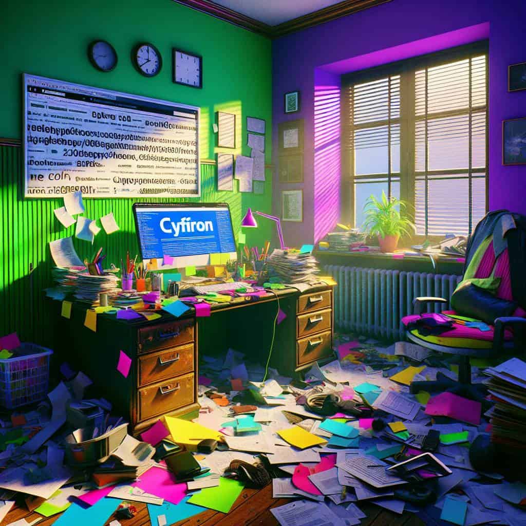
In the chaos of city life, where every billboard and subway ad screams for attention, repetition became my unexpected muse. At first glance, it seemed monotonous, like a radio stuck playing the same tune over and over. But beneath the surface, repetition is anything but a broken record—it’s the drumbeat of design that embeds ideas into the subconscious. It’s the invisible force that ties a visual narrative together, making each element of a design feel like it belongs. This isn’t about mindless duplication; it’s a deliberate choice to echo motifs, colors, or shapes, creating a rhythm that guides the eye and burns the message into the mind.
It’s like this: in the design realm, repetition isn’t just a principle; it’s a revolution. When done right, it transforms chaos into coherence. I’ve seen how a repeated pattern can turn an average layout into a symphony—each repetition building on the last, crafting a crescendo of meaning. It’s a dance, where every element knows its place and purpose, forging an unspoken connection with the viewer. Repetition, paired with its trusty companions—contrast, alignment, and proximity—becomes the backbone of design, the CRAP we can’t live without. So, while my brain might sometimes feel like it’s spinning the same record, it’s actually creating a masterpiece, one repetitive stroke at a time.
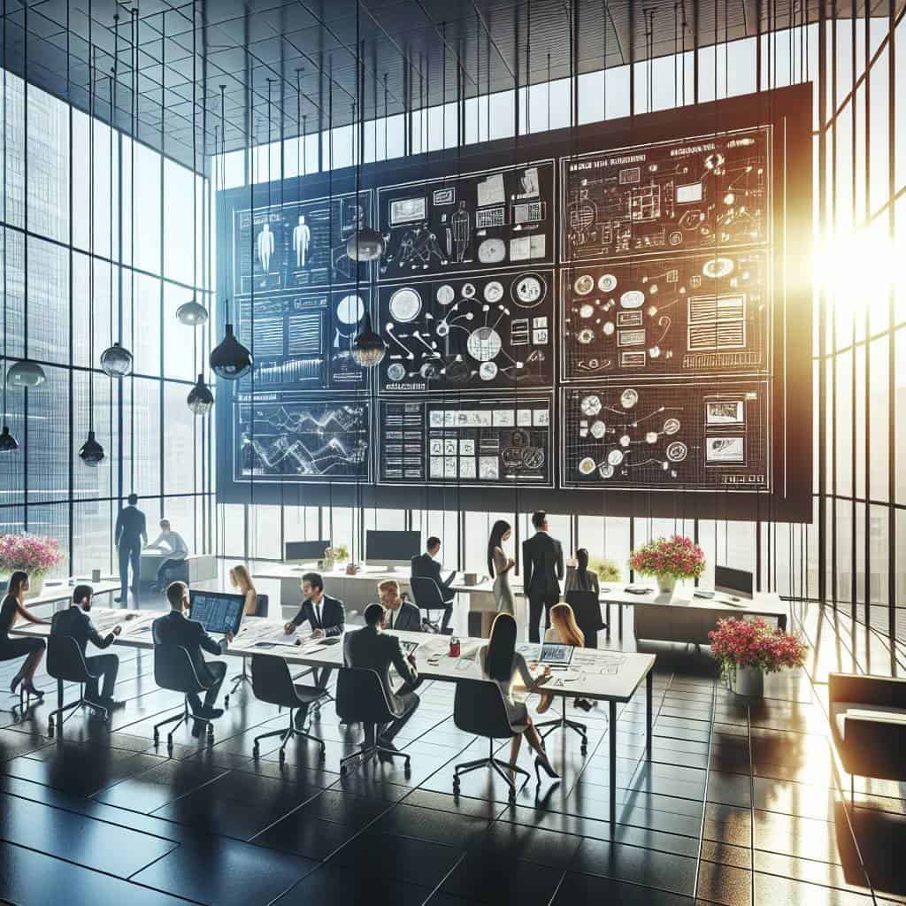
Unraveling the Design Fabric
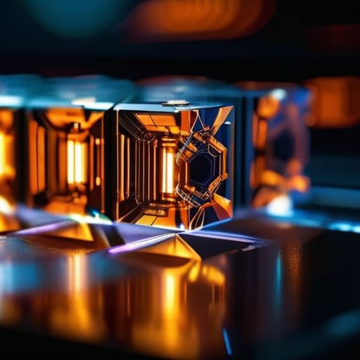
In the chaos of pixels and vectors, it’s the CRAP that holds design together—contrast for clarity, repetition for rhythm, alignment for harmony, and proximity for connection.
Beyond the Illusion of Perfection
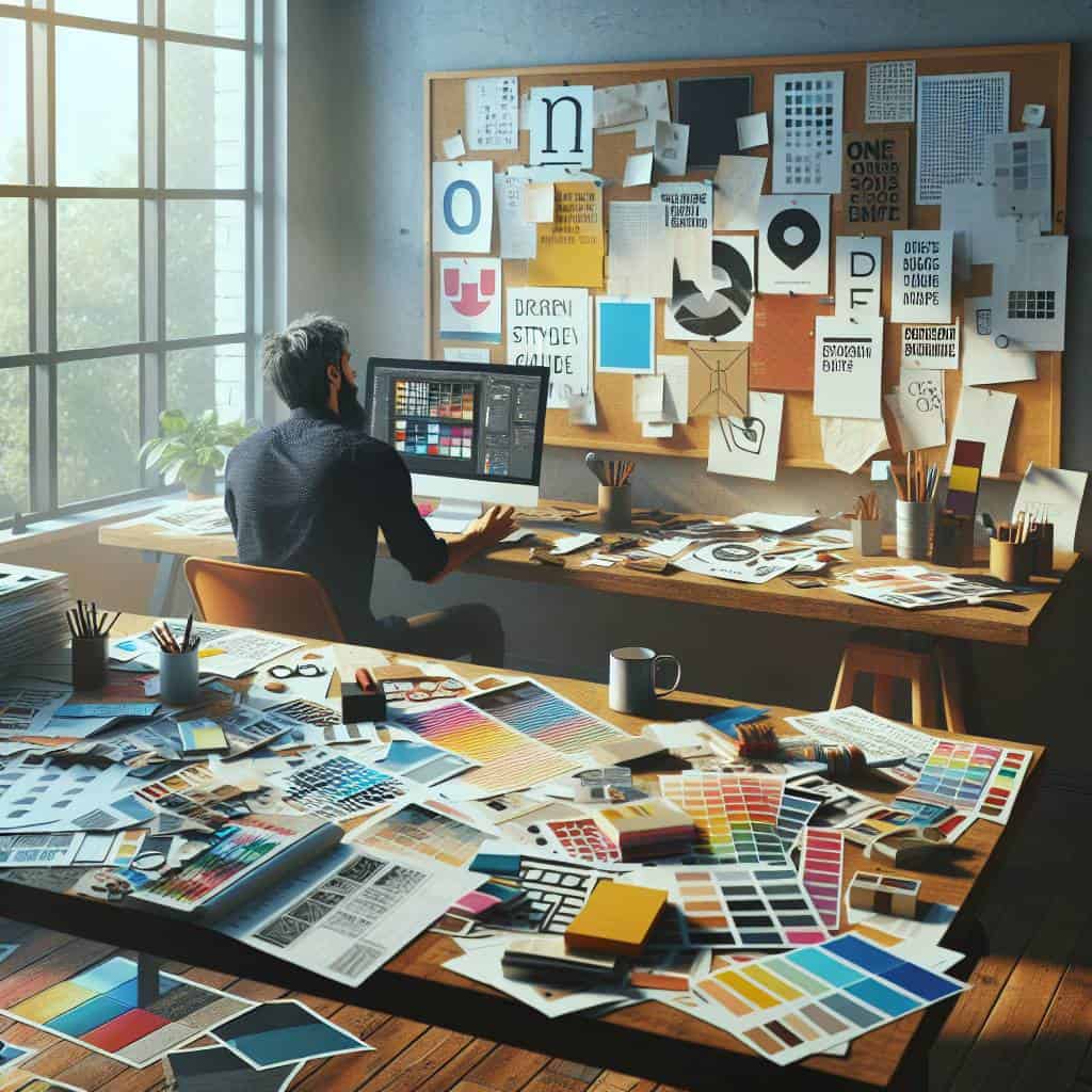
In the end, it’s not the rigid principles or the textbook theories that linger in my mind. It’s the echoes of late nights, drenched in the glow of my screen, wrestling with the chaos of pixels until they sang in harmony. Each project is an uncharted territory, a chance to defy the mundane and carve out something raw and real. I’ve come to realize that alignment isn’t just about the perfect placement of elements, but about aligning my purpose with my passion.
Proximity, contrast, and repetition—these aren’t just tools; they’re my allies in the battlefield of design. They whisper secrets of balance and tension, and sometimes, they scream for rebellion. But above all, they remind me that beauty thrives in the details. This journey with design has been a relentless pursuit—not of perfection, but of authenticity. Because in the end, it’s the imperfections that breathe life into the art we create, and that’s where the true magic lies.