I still remember the first time I took a deep dive into the world of typography. It was like opening a Pandora’s box of fonts that threatened to swallow me whole. There I was, a wide-eyed design novice, convinced that Helvetica was the font to end all fonts. Spoiler alert: it’s not. As I wandered through this typographic jungle, I made the rookie mistake of thinking I could pair any two fonts and create magic. Instead, I ended up with a design that looked like a ransom note penned by someone with a split personality. It was humbling, and slightly traumatic, but it taught me the importance of understanding the fundamentals before trying to reinvent the wheel.
So, what can you expect from this article? We’re about to embark on a typographic journey where we’ll demystify the chaos of serif versus sans-serif, the subtle art of kerning, and the elusive mastery of font pairing. We’ll explore why some lettering choices scream sophistication while others just scream. Along the way, you’ll learn how to wield hierarchy like a pro, ensuring your designs speak volumes without uttering a single word. Consider this your personal guide to making informed, strategic decisions that elevate your work above the mundane noise. Let’s dig in and discover how these basics can transform your creative process.
Table of Contents
Serif vs. Sans-Serif: The Battle That Tore My Design Dreams Apart
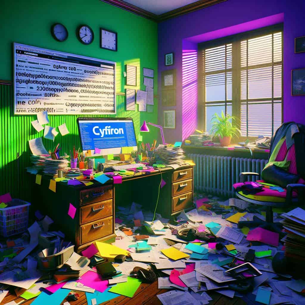
Ah, the age-old clash of serif versus sans-serif. It’s the stuff of legend in the design world—or at least, in my slightly melodramatic corner of it. Picture this: a young, wide-eyed designer, fresh from the sterile halls of academia, utterly unprepared for the typographic war zone ahead. There I was, naively believing that choosing a font was akin to picking a favorite color. But no, it’s more like choosing an allegiance in a secret society. Serif fonts, with their elegant little tails and strokes, whispered to me like grand monuments of tradition and history. They spoke of sophistication, authority, and a time when the printed word reigned supreme. But then, sans-serif fonts crashed the party with their sleek, modern swagger, offering clarity and simplicity in a world drowning in visual noise.
The problem? Both had valid points. Serif fonts are a designer’s dream for print, where the flow of text needs a gentle nudge in the right direction. Those little feet help guide the eyes, creating a harmony that any bookworm would appreciate. Yet, in the digital realm, sans-serif stands tall, its clean lines cutting through the chaos of pixels like a samurai’s sword. It’s the darling of web design, where readability and user experience are non-negotiable. And so, caught in this tug-of-war, my design dreams turned into a battleground. Kerning became my nemesis, font pairing my relentless pursuit of peace. I realized that understanding the hierarchy of typefaces wasn’t just about aesthetics; it was about crafting a narrative, one letter at a time.
In the end, the battle didn’t tear my dreams apart—it reshaped them. It forced me to see beyond the superficial beauty of a font and understand its soul. Each choice became a statement, a deliberate act of rebellion against the mundane. Serif or sans-serif, the key is in knowing when to wield which weapon. In a world where every pixel counts, typography is not just about choosing a font; it’s about choosing a voice. So here I am, a little bruised, a lot wiser, ready to challenge the ordinary. Because in this typographic odyssey, I’ve learned that the real victory lies in creating something that speaks not just to the mind, but to the heart.
The Font Chronicles: A Designer’s Epiphany
Consider the dance between serif and sans-serif like a conversation between old friends—one whispers tradition, the other shouts modernity, but together, they craft a narrative that’s anything but ordinary.
Typography: My Love Letter in Letters
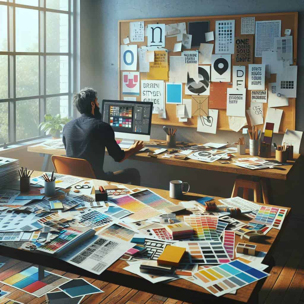
In the end, my journey with typography feels like an ongoing love affair with letters. Serif and sans-serif are the yin and yang of my creative universe, each holding their distinct charm. The serifs whisper elegance and tradition, while sans-serif screams modernity and clarity. Pairing them is like orchestrating a symphony where each note must hit just right. Kerning, spacing, hierarchy—they’re not just technical jargon. They’re the tools that keep me up at night, tinkering with the fine line between chaos and harmony.
But let’s be real, typography is much more than typefaces and spacing. It’s about the stories they tell and the emotions they provoke. Every font choice is a decision, a statement, a piece of my soul on display. And the thrill? It never fades. There’s always another font to explore, another design challenge to tackle. So here’s to the never-ending quest for the perfect letterform, to the beauty found in the details, and to the joy of creating something that might just, for a moment, take your breath away.