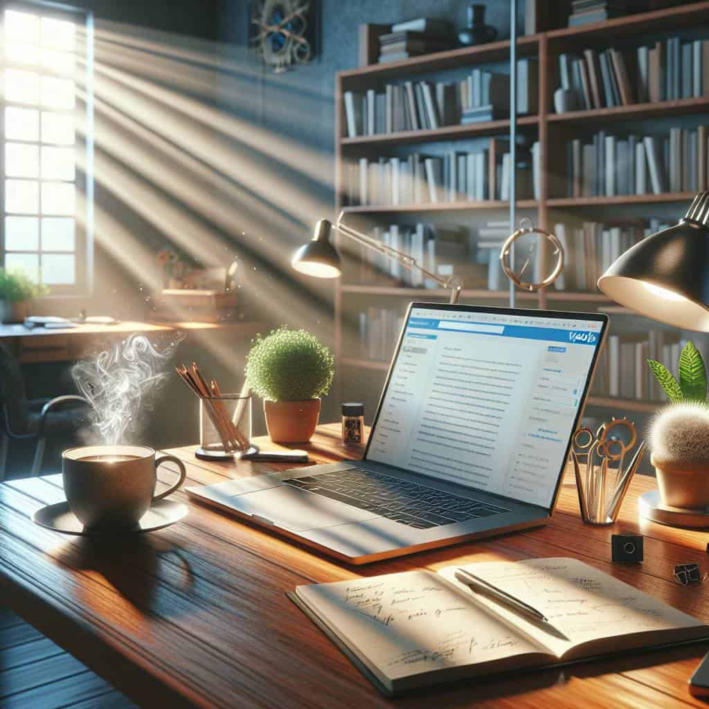
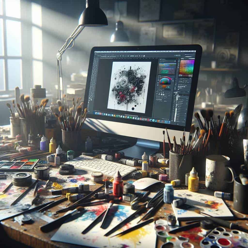
I remember the first time I opened Photoshop. It felt like stepping into a foreign country without a map or a phrasebook, just a vague promise that I’d figure it out eventually. Spoiler alert: I didn’t. Instead, I spent hours trying to find the “undo” button while my design looked like it had been attacked by a rogue kindergarten class armed with finger paint. And yet, here I am, still trying to coax beauty out of chaos, one pixel at a time. If you’ve ever felt this same bewilderment, welcome to the club.
But fear not, dear reader. Today, we’re diving headfirst into the wonderfully perplexing world of graphic design basics. We’ll chat about color theory (and why your favorite color might just be your design’s worst nightmare), the art of typography that can make or break your message, and the elusive balance of layout principles. We’ll even touch on Canva, the non-designer’s secret weapon. So buckle up, because we’re about to transform confusion into clarity, one misstep at a time.
Table of Contents
When Canva Is Your Best Friend and Worst Enemy: A Non-Designer’s Odyssey
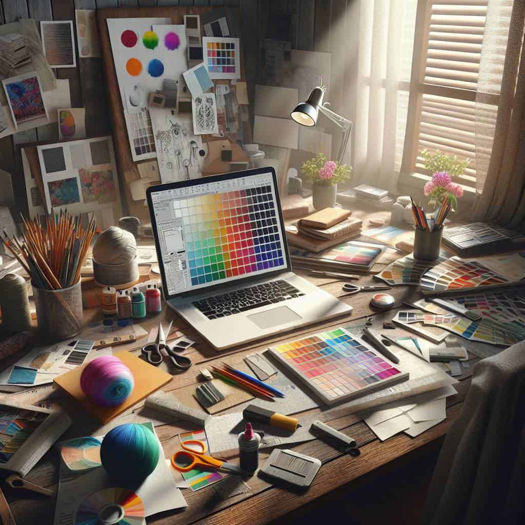
Imagine this: you’re a non-designer, thrust into the whirlwind of visual creation. You find yourself standing on the precipice of creativity, armed with nothing but a free Canva account and a vague sense of color theory, wondering if this is empowerment or entrapment. Canva is the best friend who hands you the keys to a kingdom of templates and tools, whispering sweet promises of effortless design glory. It’s like being handed a magic wand with a catch—no manual, just a “good luck” wink. Suddenly, you’re the master of color palettes, wielding typography with the confidence of a toddler wielding a crayon. It’s exhilarating. Until it’s not.
Because here’s the thing: Canva also becomes your worst enemy when you realize that a plethora of options doesn’t equate to taste. The ease with which you can drag and drop elements might lull you into a false sense of design prowess. You start questioning every choice, every font, every alignment. Is that shade of blue too aggressive? Is Comic Sans ironically cool yet? You’re deep in the abyss of decision paralysis, where the principles of design—balance, contrast, hierarchy—suddenly demand your attention like unsolvable riddles. Canva hands you the paintbrush, but it doesn’t teach you how to paint the picture. It’s up to you to navigate this landscape, to learn when to break the rules and when to adhere to them, transforming chaos into coherence.
But here’s the radical truth: this journey, this odyssey, is where the magic happens. It’s where you confront your creative demons and emerge, if not a designer, then at least a warrior with a newfound appreciation for the craft. It’s not about perfection; it’s about embracing the messy, exhilarating process of learning. In the end, Canva isn’t just a tool—it’s a training ground. A place where non-designers can stumble, fall, and rise again, each time a little more attuned to the rhythm of design. So, lean into the discomfort, my friends. It’s where real growth lies, and where we dismantle the mundane, one imperfect creation at a time.
The Unseen Symphony of Design
Typography isn’t just about choosing a font; it’s about orchestrating a visual symphony where every letter plays its part, and silence is just as powerful as sound.
The Chaotic Symphony of Design
As I sit here, surrounded by a cacophony of color swatches and half-baked layout sketches, I realize something. Graphic design isn’t just about making things look pretty—it’s a battlefield of choices where every pixel matters. You think you can just slap some text on an image and call it a day? Think again. Typography is that silent, judgmental friend who whispers, ‘That’s not quite right,’ every time you try to pair Comic Sans with anything remotely serious. It’s a delicate dance of form and function, where the wrong move can send your creation into a spiral of visual despair.
And then there’s Canva, the double-edged sword in this creative crusade. It’s the tool that promises ease and accessibility yet lures you into a false sense of security. You start with templates, thinking you’re safe, but soon you’re tweaking every element, trying to infuse a piece of your soul into something that was never meant to hold it. But that’s the beauty of this chaotic symphony we call design. It’s messy, frustrating, and occasionally maddening, but it’s also where we non-designers find our voice. So here’s to embracing the discomfort and leaning into the chaos—because that’s where the real art lives.