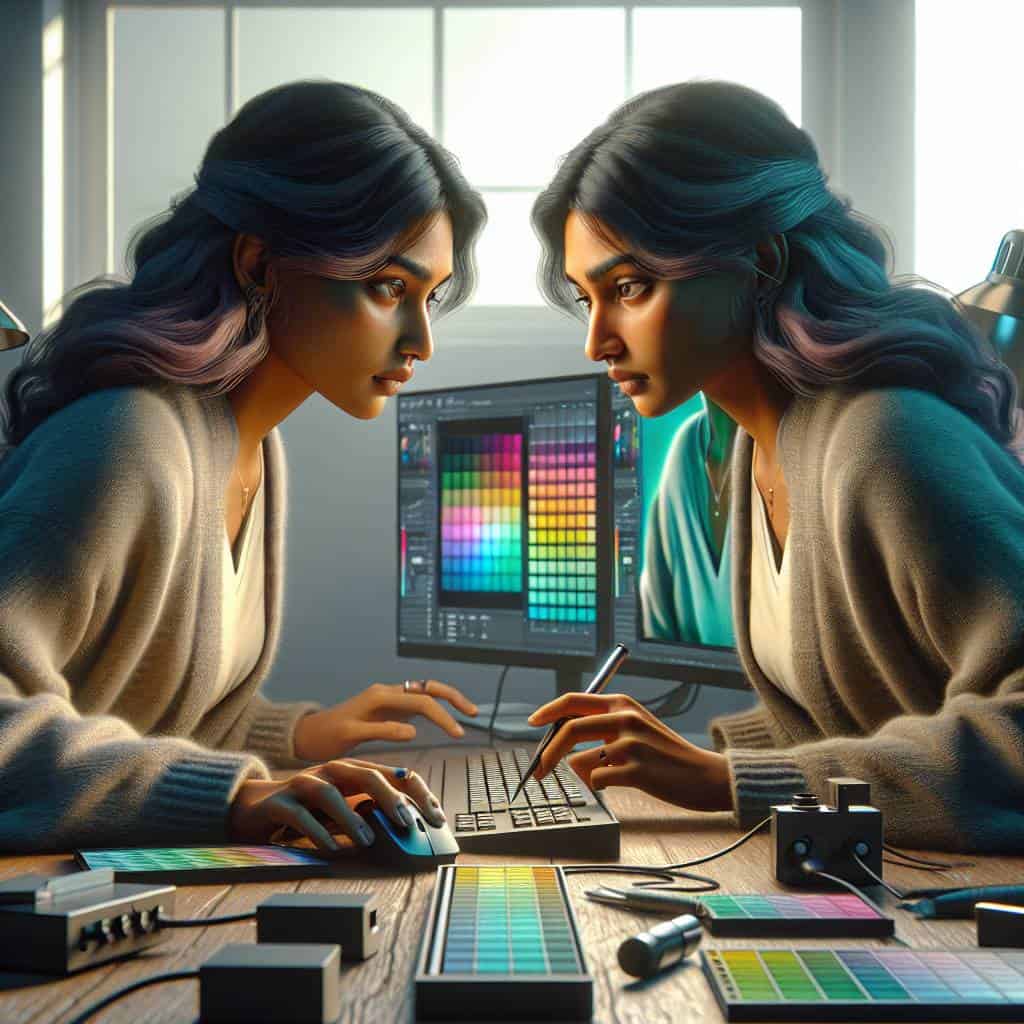
I once spent an entire night obsessing over a shade of teal that haunted my dreams. My monitor whispered lies, telling me I’d struck the perfect balance between blue and green. But when I proudly unveiled my design on a colleague’s screen the next day, it looked like a murky swamp had swallowed my artwork. A design disaster. That’s when I realized: color calibration isn’t just a fancy term thrown around by tech snobs. It’s the key to preserving your creative sanity.
So, let’s cut through the chaos together. I’ll guide you through the labyrinth of monitor calibration, ensuring your colors stay true and your designs remain pristine across any screen. From nailing down accuracy to maintaining consistency, we’ll tackle the nuances that separate amateur mishaps from professional triumphs. It’s time to make sure your masterpiece doesn’t morph into a psychedelic nightmare when it leaves your studio.
Table of Contents
Why My Monitor Thought Blue Was Actually Green
Let’s dive into the wild world of monitor calibration, where the difference between blue and green can be as baffling as a magic trick gone wrong. Imagine this: you’ve spent hours perfecting a design, meticulously choosing a shade of blue that sings like the open sky. But when you show it to a client, they squint and ask why it looks like someone spilled a bucket of pea soup on their screen. Cue the internal scream of every designer who’s been there. The culprit? A pesky little thing called color calibration—or lack thereof.
See, monitors are like people: no two are exactly the same. They come with their quirks, their unique interpretations of color. Without calibration, one monitor’s sky blue could be another’s swampy green. It’s a bit like trying to play a symphony with an orchestra that hasn’t tuned its instruments. Sure, you’ll get sound, but harmony? Not a chance. Color calibration is the maestro that ensures every device sings the same tune, making your designs consistent and true to your vision, no matter where they’re seen.
But here’s the kicker—calibrating a monitor isn’t just about getting colors right. It’s about honoring the craft and respecting the art of design. It’s about making sure that the audience sees the masterpiece you intended, not some distorted version that’s been lost in translation. So the next time your monitor insists blue is actually green, remember: it’s not magic; it’s science. And with a little calibration, you can transform your digital canvas into a realm where colors are not just accurate, but alive.
When Colors Go Rogue
Color calibration isn’t just a technical chore; it’s the guardian of your design’s truth in a world of misbehaving monitors.
When Pixels Finally Align
You know, in a world where precision often gets buried under a mountain of digital noise, understanding color calibration has become my quiet rebellion. It’s my way of shouting, ‘Hey, world! I see you in all your vibrant chaos!’—but doing so with the grace of a whisper. It’s a journey, not just of technical adjustments, but of artistic integrity. A way to ensure that what I create in my little corner of digital space stays true when it ventures out into the wild, unpredictable expanse of other screens.
So, let’s hold onto the beauty of these details. Let’s embrace the moments when we wrestle with our monitors, demanding they show us the truth of our palettes. Because, ultimately, every pixel aligned is a testament to our dedication. It’s a promise that even in a world of sameness, we can still seek—and find—our unique voice. Maybe that’s what makes this journey worthwhile: the knowledge that even in the smallest adjustments, we’re shaping how the world sees our art. And maybe, just maybe, that’s enough to keep us pressing on, one calibrated color at a time.


