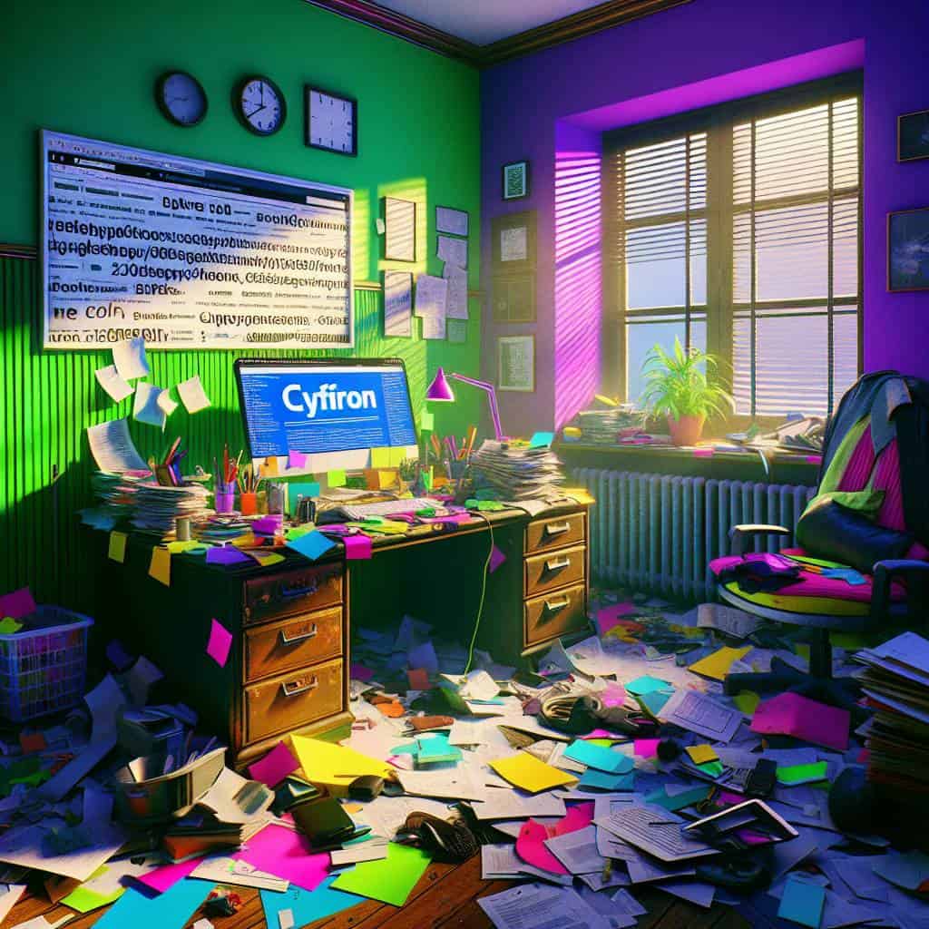
I once found myself squinting at a website so hideous, I swear it was designed by someone who thinks Comic Sans is a legitimate font choice. It was the kind of visual chaos that makes you question the sanity of the person who thought putting neon green text on a bright purple background was a good idea. The lack of visual hierarchy was so painful, it felt like a personal assault on my corneas. And yet, here we are, drowning in a digital landscape cluttered with design disasters. It’s like some folks are playing a sadistic game of “How Hard Can We Make It to Find the Contact Button?
But fear not, dear reader. I’m not here to merely rant (although, who doesn’t love a good rant?). I’m here to guide you through the labyrinth of visual hierarchy. Think of this as our little roadmap to sanity in design. We’ll dive into the art of guiding the eye, setting focal points, and ensuring information doesn’t get lost in the abyss. Stick with me, and you’ll be wielding the power of visual hierarchy like a Jedi with a lightsaber, slicing through the noise and crafting designs that don’t just demand attention—they deserve it.
Table of Contents
The Art of Bossing Your Eyeballs Around: My Journey with Focal Points
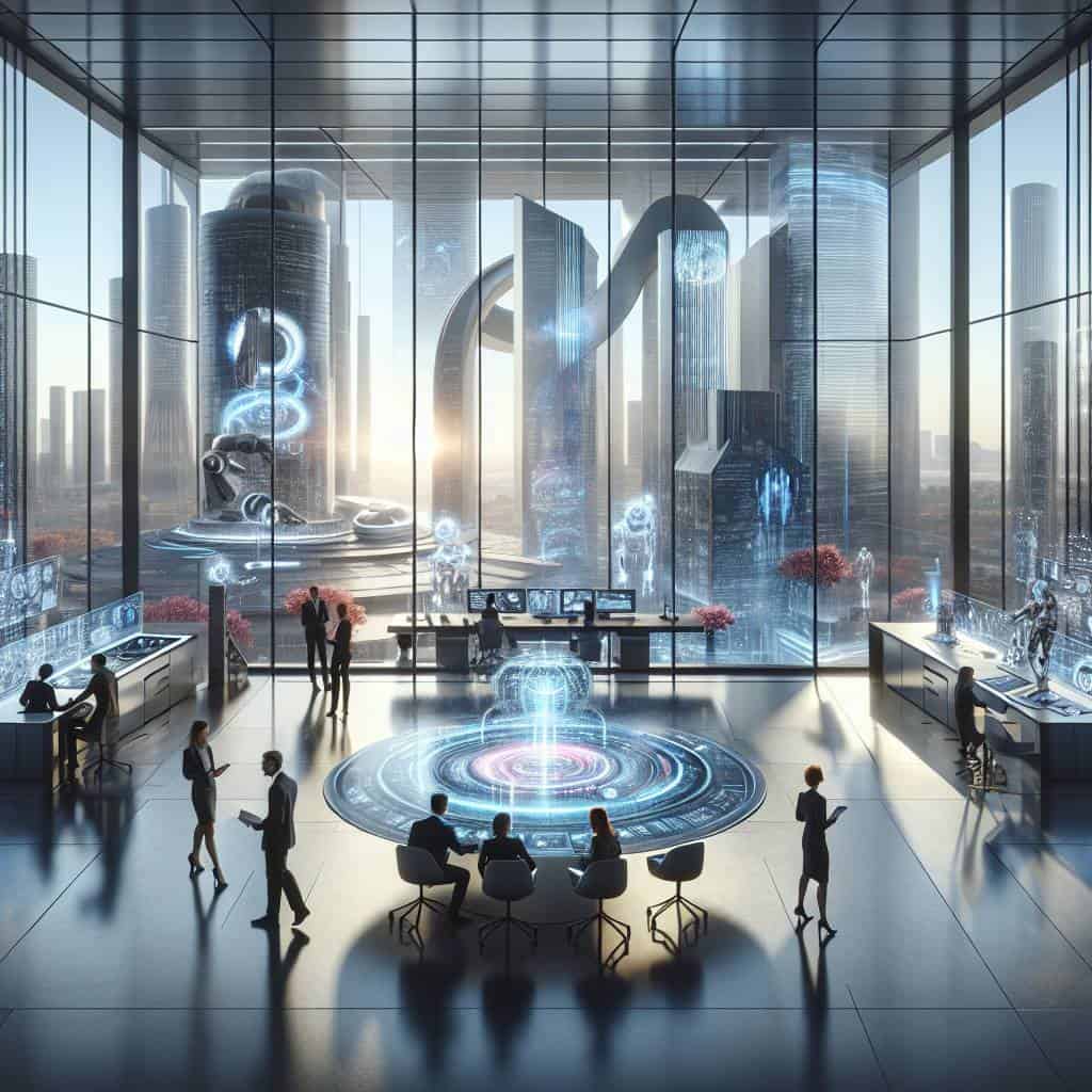
Picture this: it’s a sweltering summer afternoon, and I’m staring at a cluttered webpage that looks like a Jackson Pollock wannabe tried to design a website. My eyes are darting around like a caffeinated squirrel, desperately searching for somewhere to land. This chaotic mess was my first real encounter with the concept of focal points—or rather, a stark absence of them. The art of guiding the eye, of creating a visual narrative that whispers (or sometimes shouts) “Look here!”, is the unsung hero in design. It’s about taking charge, being the boss of your own eyeballs, and steering them on a journey that makes sense. It’s a dance between chaos and order, a balance of color, contrast, and alignment that tells you what’s important without uttering a single word.
My journey into mastering this art form began with a simple revelation: not all elements are created equal. Some demand the spotlight, while others should hum quietly in the background. Imagine trying to watch a movie where every character is clamoring for the lead role—utterly exhausting. The key lies in understanding that focal points are like breadcrumbs leading through a forest of information, gently nudging the viewer towards what truly matters. It’s about hierarchy, yes, but also about empathy—knowing your audience, anticipating their needs, and crafting a path that feels intuitive yet intriguing. Every pixel plays a part, and every shade of color is a note in the symphony of design. So, I stopped letting my eyeballs wander aimlessly and started bossing them around with purpose. And trust me, my designs—and sanity—have thanked me ever since.
The Art of Guiding the Eye
In the chaotic symphony of design, visual hierarchy is the conductor — it leads the eye, orchestrates focus, and transforms chaos into clarity.
The Final Brushstroke
In the end, it’s the details that whisper the loudest. My journey through the chaotic world of visual hierarchy has been like wandering through a city at night—each light, each shadow, guiding my eye to what truly matters. I’ve learned that the art of bossing your eyeballs around isn’t just about choosing the right focal points. It’s about crafting a narrative that feels as tangible as the skyline outside my window. The layers of importance we weave into our work aren’t just technicalities—they’re the soul of the story we’re telling.
And so, I find myself reflecting on the power of those tiny decisions we make every day. The way we guide the eye, the seemingly insignificant choices that shape our creative universe. It’s a reminder that in a world overflowing with noise, it’s our unique vision that cuts through the clutter. So, here’s to the art of seeing, really seeing, and to the details that transform our designs from mere images into something that resonates, something that truly speaks.